A shelf talker only earns its keep if a shopper actually sees it and it survives the aisle long enough to matter. Both of those outcomes are decided less by the artwork than by two specifications people tend to pick last: the size and the way it attaches to the fixture. Get those wrong and even a beautiful design ends up crooked, hidden behind a facing, or on the floor by Tuesday. This is a side-by-side look at the sizes and mounting formats, and how to match them to where the sign will actually live.
Start with size, because the shelf sets the limit
Shelf talkers cluster around a handful of standard sizes, and the differences in printable area between them are larger than they look on a screen. The common ladder runs from a compact 2 by 3 inches up to a half-page 5.5 by 8.5, with 3 by 5 inches doing most of the work in real stores.
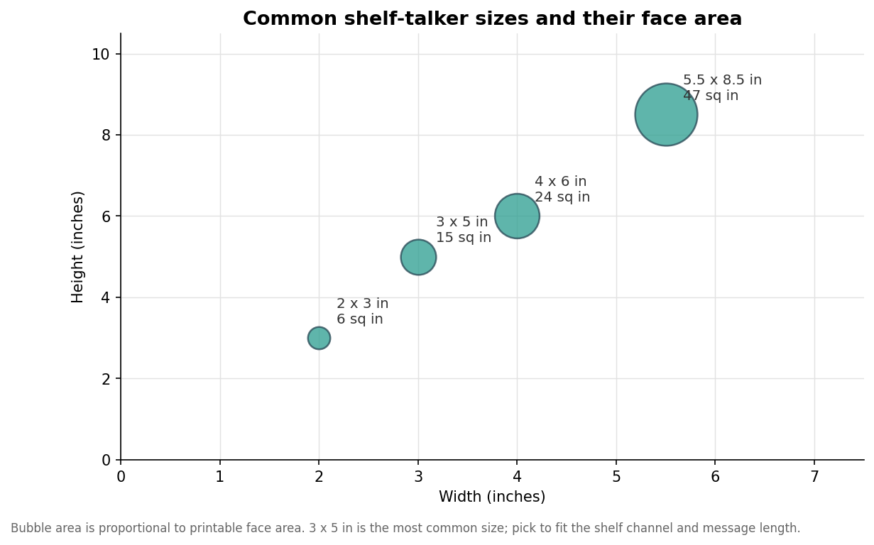
The right size is a negotiation with the fixture, not a free choice. A grocery gondola with tight vertical spacing between shelves physically cannot accept a tall sign without it curling or colliding with the product above, which is why the compact sizes dominate food and beverage aisles. Wider, taller formats belong on endcaps, in cosmetics and electronics sections with more open facings, or anywhere the sign needs to carry a longer story rather than a single price or claim. A useful rule is to size for the message: a price point or a short callout wants a small talker, while a QR code, a few benefit lines, or regulatory text needs the larger face. When in doubt, measure the actual shelf channel before committing, because a sign that does not fit the fixture is scrap regardless of how good it looks.
The five ways a shelf talker attaches
Mounting is where shelf talkers genuinely diverge, and each format buys you something at the cost of something else. A wobbler hangs on a flexible arm so it bounces slightly with passing air and foot traffic, which draws the eye but can tangle or get bent. A clip or gripper snaps onto the shelf edge and is the most repositionable option, ideal for testing placements or frequent promo changes. An adhesive strip is the simplest to apply but is essentially single-use, since removing it cleanly is hit or miss. A blade or flag sign projects perpendicular into the aisle for maximum visibility down a long run, at the price of being easy to knock and prone to damage. A shelf-edge strip sits flush in the price channel, protected and tidy, but by design it does not stand out.
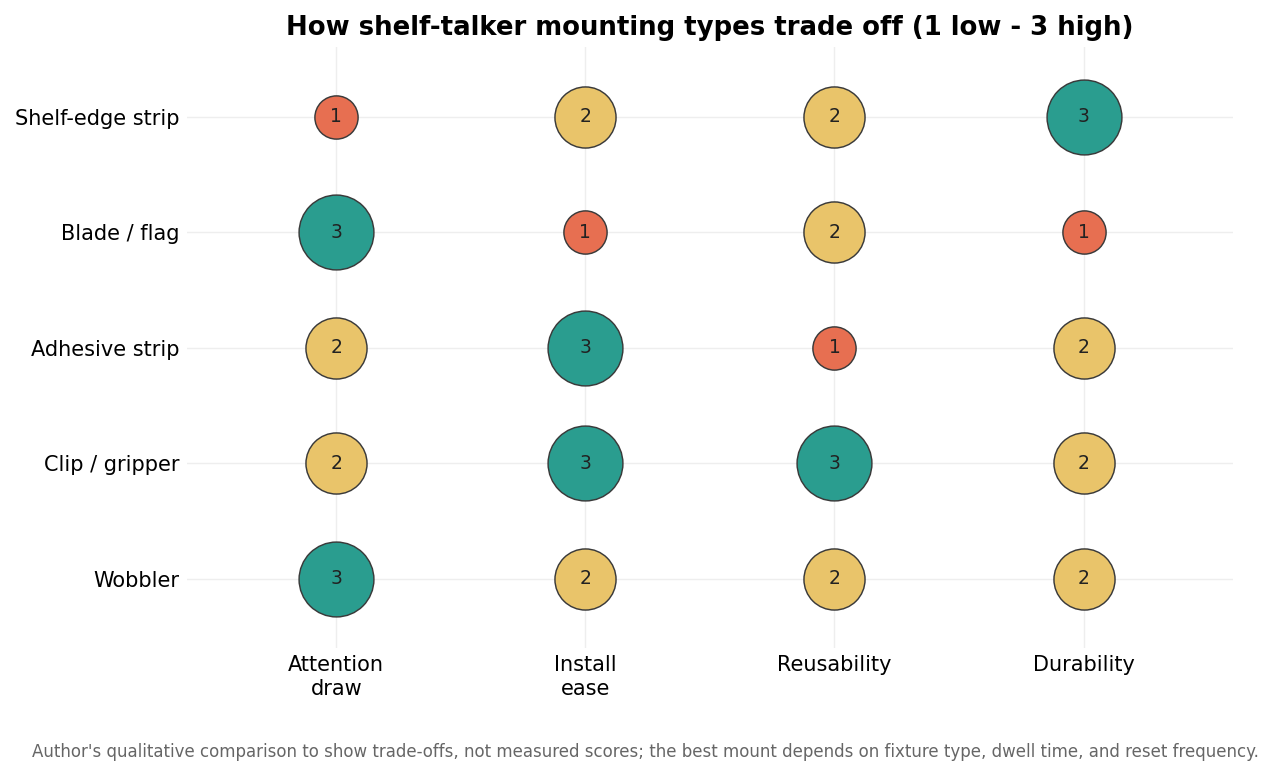
Reading the comparison, the pattern is that attention and durability rarely come in the same package. The formats that grab the most notice, the wobbler and the blade, are also the ones most exposed to being bent or bumped, while the tidy, protected shelf-edge strip is the least likely to be seen from a distance. There is no single best mount, only the one that fits how the sign is meant to work in a specific spot.
Match the mount to the environment
The environment usually makes the choice for you once you take it seriously. In a high-traffic promotional aisle where standing out matters and staff reset displays often, a clip-mounted talker gives you visibility plus the freedom to move it without residue or damage. In a slower, premium section where the sign will stay put for a season, an adhesive or channel mount keeps things clean and permanent. For a category where you are fighting for attention against a wall of similar products, a blade sign that breaks the plane of the shelf is worth the fragility, provided you accept a higher replacement rate. And in tightly regulated or tightly spaced aisles, the flush shelf-edge strip is often the only format that is even allowed.
Two operational realities deserve weight here. First, reset frequency: if the campaign changes weekly, prioritize a mount you can remove and reposition without wrecking the sign or the fixture, which points to clips over adhesive. Second, the retailer’s own rules, because many chains restrict projecting signage and dictate approved holders; confirming that before you print saves an entire run from rejection at the door.
Material follows the mount
Once size and mount are set, the material almost chooses itself. Short-term promotions on a clip or adhesive mount are well served by coated cardstock, which prints vividly and costs the least, and a matte or gloss laminate adds enough scuff resistance to get through a few weeks of handling. Anything expected to live longer, face moisture, or ride an exposed blade should move to PVC or PET plastic, which shrug off humidity and bending that would dog-ear paper. Acrylic and rigid substrates exist for premium, semi-permanent displays where the sign is part of the fixture rather than a swappable promo. The through-line is simple: the more exposed and longer-lived the placement, the more durable and rigid the material needs to be, and paying for plastic on a one-week price flag is as wasteful as printing a season-long endcap sign on bare cardstock.
Specifying the order
A clean shelf-talker spec answers four questions in sequence: how big, how it mounts, what environment it lives in, and therefore what material and finish it needs. Decide the size against the real fixture, choose the mount for the balance of attention and durability the placement demands, confirm the retailer allows it, and let those choices dictate the substrate. Done in that order, the artwork lands where a shopper will see it and stays there long enough to do its job, which is the entire point of putting a sign on the shelf in the first place.
Leave a Reply